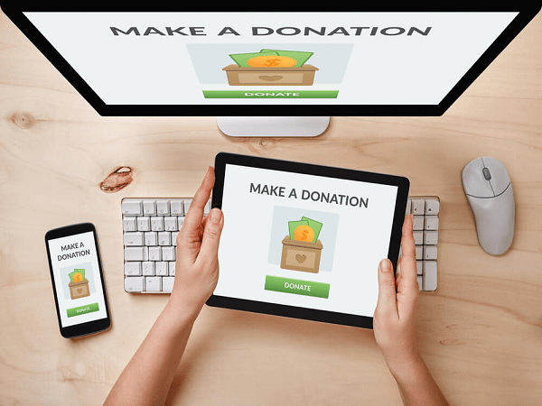
A well-designed, easy-to-navigate website is essential for an effective nonprofit digital marketing strategy.
Your website is the main hub where supporters learn about your mission and explore ways to get involved.
Nonprofit online giving grew 42% from 2018 to 2021, so you’ll likely accept and track a large number of donations through your website.
But in order to stand out and attract donors to your site, you’ll want to design the site for maximum donor engagement.
In this post, we’ll walk you through three great ways to attract donors to your organization’s website:
- keep your website’s branding consistent;
- prioritize user experience (UX) and accessibility in web design; and,
- promote your website through your nonprofit’s other marketing channels.
To help you visualize what these web design ideas look like in action, review other good nonprofit websites, like those on Kanopi's list. Also, partnering with a web design agency can help take your organization’s website to the next level as you design for donor engagement or solve problems that may come up along the way.
Keep your website’s branding consistent.
Establishing a unique brand is key to attracting supporters to your nonprofit. Even though you aren’t selling a product or service like traditional brands, you’re selling involvement in your nonprofit’s mission.
Your nonprofit’s brand makes your marketing materials—especially your website—memorable for supporters. It also allows you to stand out from other similar organizations and raise awareness about your fundraising efforts.
Some branding elements for your nonprofit to focus on as you review your web design include:
- Fonts: For visual variety, choose at least two brand typefaces: one for headings and one for body text. But keep it simple—if you use more than three, your website might look cluttered.
- Colors: Color psychology can heavily affect branding, so pick a few brand colors that will reflect what you want supporters to think about your organization. (For example, red is often associated with urgency, blue is associated with trustworthiness, etc.)
- Logo: Design a simple logo using your brand fonts and colors. To make it stick in supporters’ minds, feature it in your website’s header and your other marketing materials.
- Images: Any photos or graphics you use should reflect your organization’s mission and inspire visitors to your website to learn more or get involved.
To ensure that your branding stays consistent, create a digital brand guide detailing how all these elements should be used. You might update the guide occasionally, but it’ll serve as a foundation for anyone inside or outside your organization who works on your website.
Prioritize UX and accessibility in web design.
Even if you do a great job with branding, donors will only want to return to your website if it’s easy and engaging to use. You’ll want to design the site with user experience (UX) in mind and test it regularly to see what’s working and what could be improved.
While each CMS (for example, WordPress or Drupal) has different built-in features, you can make your site easier to use on any hosting platform by focusing on these aspects:
- Make sure pages load quickly: An easy way to improve page load speed is to compress your image files as much as you can without losing their quality—images that take up less storage space load faster.
- Design a logical site navigation method: Check that important parts of your website, like your “About” page and “Give” page, are easy to find from your site menu.
- Reduce content clutter: Delete any duplicate pages or information, and break up long blocks of text with images or subheadings to make them more readable.
The most important aspect of UX is accessibility, since every interested supporter should be able to interact with your website easily. Make sure your website adheres to accessibility guidelines including:
- Color contrast: Dark text on a light background or light text on a dark background is easier to read on a dim screen or for supporters with low vision.
- Image alt text: Ensure every image on your website has alternative text, which is helpful if visitors have poor internet connection or if they’re using screen-reading assistive technology.
- Closed captioning or transcripts of audio/video files: A written version of sound-based content will be helpful for supporters who are hard of hearing or can’t turn up their device’s volume for any reason.
Always keep in mind that UX and accessible design also apply to the mobile version of your website—review your site using a smartphone or tablet as well as a computer when you troubleshoot UX issues.
Promote your website through your nonprofit’s other marketing channels.
Once your website has consistent branding, is optimized for UX, and meets accessibility standards, you can direct donors to it by incorporating links into your other nonprofit marketing materials. Some great places to link to your website include:
- Email marketing: Include the link in a call to action or a “for more information” section within the body of your message.
- Social media: Depending on the platform, you can place web page links in post captions or in your profile for followers to access.
- Direct mail: Even though you’ll print the letters, you can still add an easy-to-type URL or QR code to drive traffic to your website.
On all of these marketing platforms, prompt supporters to visit your website by introducing them to an initiative or campaign and then directing them to your site to learn more, get involved, or donate.
- Perform UX and accessibility audits of your nonprofit’s website to identify areas for improvement.
- Review your marketing plan to find where you can add website links to your other communications.
- Consider partnering with a web design agency to maximize your potential in attracting donors to your site.